Way back in the dark ages when we did everything by hand in art school, one of my favorite classes was package design. For our final, we were to take a current product and redesign it. Since, I’m Irish, half from the orange side and half from the green side, I decided to redesign the green and white Twinings Irish Breakfast Tea box. My redesign had the background of the box in orange, white type, and a green three-leaf clover.
Since graduation, I’ve designed plenty of logos, business cards, stationery packs, newspapers, brochures, etc., but something was missing. That was my dream to design a product box and then see it on store shelves.
The dream came true in 2019. A client who I design and maintain two hair product websites for came to me and asked if I’d be interested in designing a box for a flat iron they were developing. I said yes with no hesitation.
They wanted their design to be nothing like what is already on the shelves. Part of this request was made easy as the plain box already stood out from what you see in the stores.
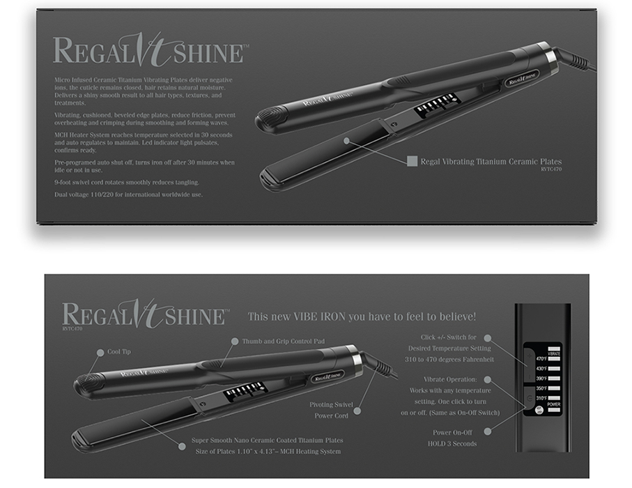
After I designed the logo, we decided the background of the box would be black, and the type and logo in Pantone 877, a metallic gray, elegant and not overbearing. Also, when necessary instead of using the Pantone color, forty percent black could be used and there would not be any visible difference.
With the logo and colors designed, next came my biggest challenge. The flat iron product line comes in two different styles, but the client only wanted one box. Since elegance was what we were going for in the design, I was opposed to a design that would have someone taking a Sharpie pen and putting an X in the appropriate spot. I had visions of gigantic Xs on the box somewhere close to where they were supposed to be. After a lot of back and forth with the client, he gave in to having two separate boxes.
Once the decision was made to design two separate boxes, he still wanted to show both flat irons on the box. Putting both on the front of the box wouldn’t work as that would still require a spot for an X. Besides both flat irons on the front of the box were confusing to us, and more than likely would leave the potential buyer confused as to what was really in the box.
Having four sides of the box to work with, I decided to put one flat iron with the information about it on the top of the box and the other on the bottom. With the way the box opens, it is easy for someone to figure out which flat iron is in the box.
Was this an award-winning design?
For the past three years, I’ve entered the annual American Graphic Design Award competition. I’ve been selected for logo design, website design, and a book cover design. With my dream design job was completed, and all involved in the project feeling the design far superior to anything in the stores, the question became; was it an award-winning design?
Yes. I entered the competition on a Friday and was notified on the following Monday, that out of 12,000 entries, 600 designs were selected as winners, mine was given the award in the package design category. An award-winning dream comes to life.
Not only is the package design great, and I’m not the only one who says that, but the flat iron is also the best I’ve ever used. To learn more about the flat iron, go to RegalVTShine, where they are also available for purchase.
Do you have a product you want to bring to the market, but can’t figure out where to start with the design, let’s chat?


0 Comments