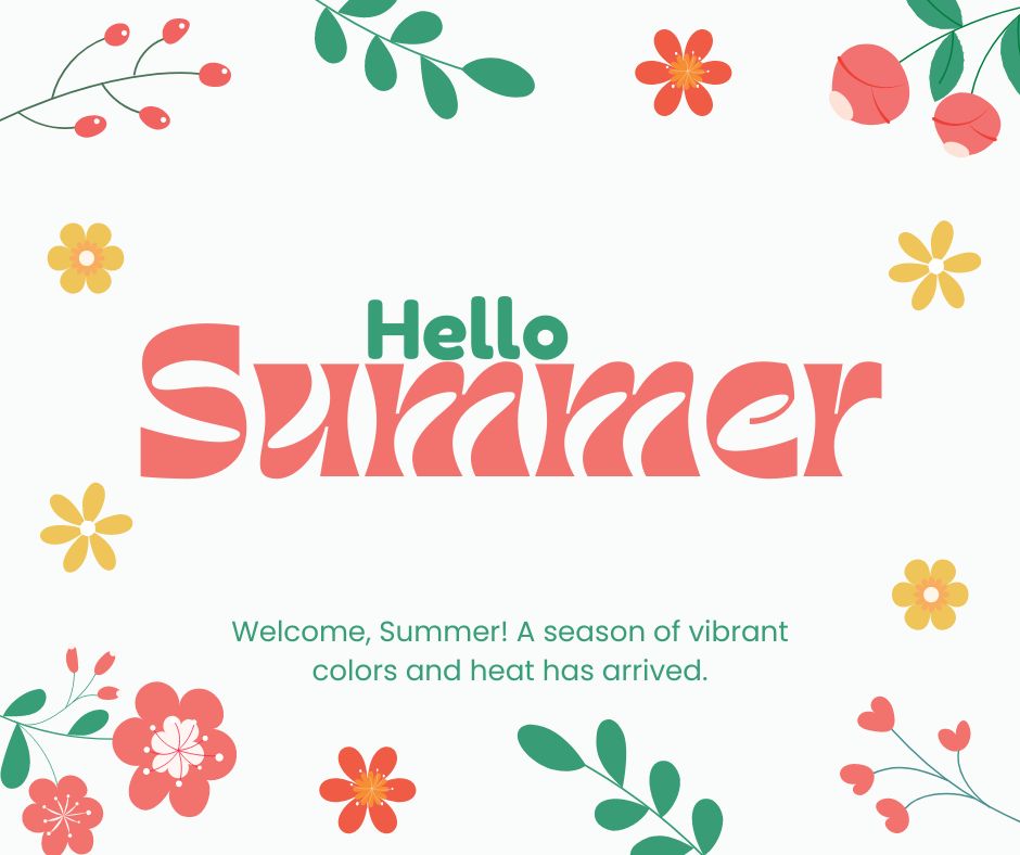
Decorative fonts can indeed add a unique and eye-catching flair to your designs, but there are several considerations to keep in mind regarding readability and accessibility:
- Legibility: Decorative fonts can often be intricate or have unusual shapes that make them difficult to read, especially at smaller sizes. This can be a significant issue for people with visual impairments or dyslexia.
- Context Appropriateness: While decorative fonts are great for headlines, titles, or graphic elements, they are usually not suitable for body text or long paragraphs. Overuse can make your content harder to digest.
- Cultural Considerations: Some decorative fonts may have stylized elements that can be misinterpreted or culturally insensitive if not carefully chosen.
- Consistency: Using too many different types of decorative fonts in one design can lead to a cluttered and unprofessional appearance. It’s often best to limit the number of fonts you use.
- Screen Compatibility: Some decorative fonts may not render well on all devices, especially older or mobile screens, leading to potential readability issues.
- Loading Times: Embedded fonts can increase the loading time of a webpage if not properly optimized or if they are large in file size.
In summary, while decorative fonts can enhance the visual appeal of your design, ensuring readability and accessibility for all users is paramount. It’s always a good practice to test your design on different devices and get feedback from a diverse audience to make sure it is both attractive and functional.


0 Comments