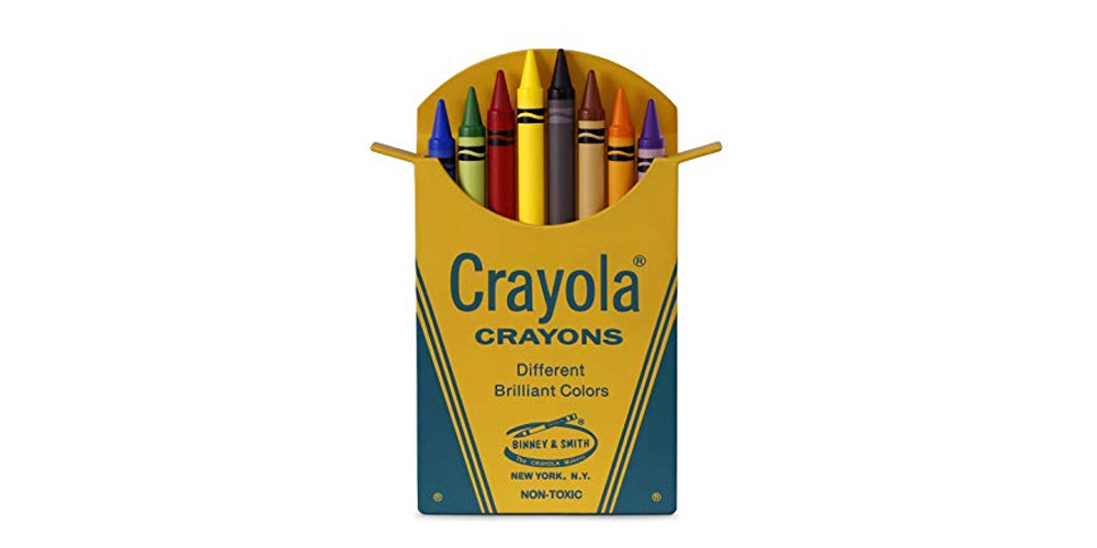
Did you ever wonder why your first box of crayons had only eight colors? It all started in 1926 when the maker of crayons Binney & Smith acquired the Munsell Color Company’s line of crayons. The Munsell company had based their product line on the color wheel and in 1930 Binney & Smith, also adopted the use of the color wheel.
How does the color wheel work? It’s broken down into three sections, primary, secondary, and tertiary.
Primary Colors

Where everything begins:
Red, Yellow, and Blue
On the color wheel, you see red is at the top and yellow is on the right with blue being on the left.
Secondary Colors
Next comes the secondary colors which are a mix of the primary colors:
Red and Yellow = Orange
Yellow and Blue = Green
Blue and Red = Purple
You will find orange in the upper right-hand side, purple in the left-hand side, and green at the bottom of the color wheel above.
Tertiary Colors
When you mix primary and secondary colors, you get tertiary colors which are:
Red-orange, Yellow-orange, Yellow-green, Blue-green, Blue-purple and Red-purple
On the color wheel, you will see that, red-orange sits between red and orange, yellow-orange between orange and yellow, yellow-green between yellow and green, blue-green between green and blue, blue-purple between blue and purple and finally, red-purple between purple and red.
Color Harmony
You achieve color harmony when the colors are pleasing to the eye. Viewers will be engaged, and it creates an inner sense of order and balance. When something is not harmonious, it will be seen as either boring or chaotic. If the visual experience is so bland, you will not engage a viewer. On the other hand, you will not engage a viewer, if something overdone or so chaotic. It is built into our brains what we cannot understand, we reject. Color harmony requires a logical structure and a sense of order.
Formulas for Color Harmony
Formulas to achieve color harmony can be a simple process or something that will make you want to rip your hair out. It all depends on how many colors you want to mix together.

Analogous Colors
Analogous colors are any three colors that are side by side on a 12-part color wheel, such as yellow-green, yellow, and yellow-orange. Usually one of the three colors predominate.

Split-Complementary Colors
Split-complementary colors work similarly to complementary, but they use more colors. As an example, if you choose the blue color you need to take two others which are adjacent to its opposite color meaning yellow and red. The contrast here is less sharp than in complementary colors but it allows the use of more colors.

Complementary Colors
Complementary colors are any two colors that are directly opposite each other, such as red and green and red-purple and yellow-green. These opposing colors create an unconscious peach of mind and well-being.

Double-Complementary Colors
Double-complementary colors are the most difficult to balance. You use four colors from the wheel which are complementary pairs. When you connect the points, they form the square. It is hard to harmonize but if done correctly, the results are stunning.
The answer to “Why did your first box of crayons have only eight colors?” As you learned in “The Basics: Part One – How Color Can Work for You” they are the basics.
Are you trying to combine colors, but they just don’t look right, let’s chat?


0 Comments