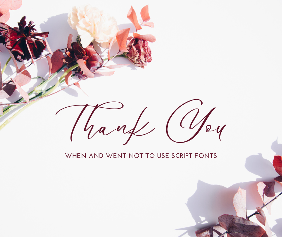
The benefits of using a script font
Using script fonts effectively can add a touch of elegance, personality, or informality to your design. Here are some tips on how to use them correctly:
Legibility: Ensure that the script font you choose is legible, especially when used in smaller sizes or for longer passages of text. Some script fonts are highly decorative and might be more suitable for titles or headings rather than body text.
Contrast: Pair script fonts with contrasting typefaces to create visual interest and maintain readability. For example, pair a script font with a sans-serif or serif font to create a balanced composition.
Hierarchy: Use script fonts to emphasize key elements such as headings, titles, or important phrases. This helps create a hierarchy and guides the reader’s attention through the design.
Spacing and Kerning: Pay attention to the spacing and kerning of script fonts to ensure that the letters flow smoothly and are easily readable. Adjust the tracking and kerning as needed to optimize legibility and aesthetics.
Context: Consider the context in which the script font will be used. Script fonts may be appropriate for certain design projects such as wedding invitations, greeting cards, or branding materials, but may not be suitable for others like technical documents or formal reports.
Consistency: Maintain consistency in the use of script fonts throughout your design to create a cohesive look and feel. Use the same script font for similar elements across different pages or sections of your design.
Size and Scale: Pay attention to the size and scale of script fonts relative to other elements in your design. Avoid using script fonts at very small sizes, as they may become difficult to read, especially when printed or viewed on screens.
Color and Texture: Experiment with different colors and textures to enhance the appearance of script fonts. Consider using subtle gradients, shadows, or textures to add depth and dimension to the text.
Avoid Overuse: Use script fonts sparingly to prevent them from overpowering your design. Reserve script fonts for special occasions or to add emphasis to specific elements rather than using them for all text.
Test and Iterate: Finally, test different script fonts and combinations to see what works best for your design. Don’t be afraid to iterate and make adjustments until you achieve the desired look and feel.
When not to use a script font
While script fonts can add flair and personality to your design, there are certain situations where it’s best to avoid using them:
Formal Documents: For formal documents such as business reports, legal contracts, or academic papers, it’s generally best to avoid script fonts. Stick to more traditional and readable typefaces like serif or sans-serif fonts for better professionalism and readability.
Small Text: Script fonts tend to be less legible, especially when used at small sizes. Avoid using script fonts for body text or small labels where readability is crucial. Opt for more legible fonts that are designed for small sizes.
Digital Screens: Script fonts can be difficult to read on digital screens, particularly at smaller sizes or low resolutions. When designing for digital platforms such as websites, mobile apps, or presentations, choose fonts that are optimized for screen readability.
Accessibility Considerations: Script fonts may pose accessibility challenges for individuals with visual impairments or dyslexia. These fonts can be harder to read for some people, so it’s important to prioritize accessibility by choosing fonts that are clear and easy to read for all users.
Technical Documents: Avoid using script fonts in technical documents such as manuals, instructions, or technical reports where clarity and precision are essential. Stick to simple, easy-to-read fonts that convey information clearly without distractions.
Corporate Branding: While script fonts can be used effectively in branding to convey a specific tone or personality, they may not always align with the brand image or values of a corporate entity. Consider the brand’s identity and target audience before incorporating script fonts into corporate branding materials.
Multilingual Content: Script fonts may not support all languages or character sets, which can lead to inconsistencies or readability issues in multilingual content. Choose fonts that support the languages used in your content to ensure consistent readability across different languages.
Emergency Information: In situations where clarity and urgency are paramount, such as emergency signs, safety instructions, or warning labels, avoid using script fonts. Opt for highly legible fonts with clear letterforms to ensure that the information is easily understood at a glance.
By being mindful of these situations and considering the readability, context, and audience preferences, you can make informed decisions about when to use or avoid using script fonts in your design projects.
In the end, the biggest rule is never to use all caps when you are using a script font.


0 Comments