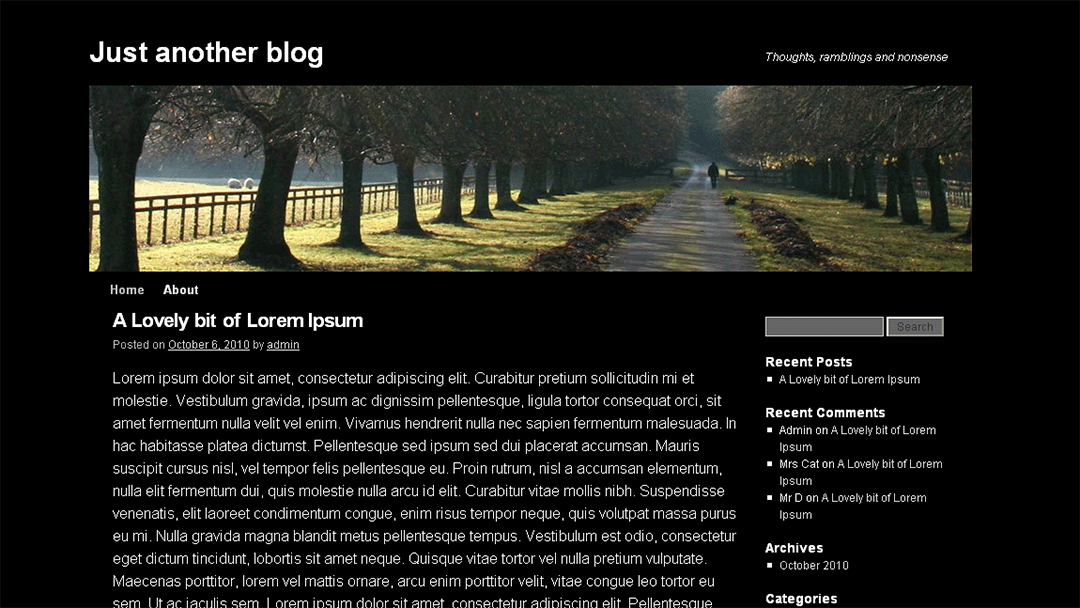
My website designs are known for being well thought out and easy to navigate. One of the first steps I took in achieving this was to get rid of the sidebar. At first, not everyone understood my logic, that was until smartphones and tablets became the main devices for surfing the internet.
The sidebar had its time and place. As soon as I switched over to WordPress in 2009 through 2014 every website, I designed had one. It gave a place to put all kinds of things that wouldn’t fit into the primary menu bar. But today when you look at a website with a sidebar on a smartphone or tablet, it’s the first thing you see. I can’t tell you how many websites I’ve left, especially on my phone because I got tired of scrolling down trying to find the article I wanted to read.
The problem is not only that they show up first, but I also started questioning whether the information I was putting there was really all that important. Most contained a search field, a menu section, an archive section, a section for your affiliate links, a category section, and finally an admin login section. Now, let’s look at the importance of each individual section.
The search field
Unless your website is either a catalog, recipe, medical, or well-established travel blog, what exactly are people going to be searching for?
The menu section
This is a repeat of what is in your primary menu at the top of your website. On a laptop or desktop machine, people can see both, that is until they start scrolling down, then they can’t see either.
The archive section
Are people really going to read your articles from 2015 or earlier? Probably not.
The affiliate section
This is the section that seems most baffling to me. I understand if you are wanting to monetize your blog you need affiliate links. But, are they more important than your own content? Remember before someone has a chance to read your content, they will first see your affiliate links.
The category section
The category section is one section that has validity. But is there a better place to put it? The answer, yes, in your primary menu.
The admin section
All I can say is I never understood why this section was ever there.
What if you feel differently and think they are important
With respect to your archive articles, place the Archive widget in your footer along with an opt-in in form for people to register and keep up to date with you.
With regards to your affiliate links and categories, there is another simple solution; put both of them in your primary menu.
The steps are quite easy on how to achieve this. Login into your Dashboard, and go down to Appearance, when you see Menus, click on it.
This will open a window with a section called “Add menu items.” Here you will have several options, but the two you are interested in are “Custom Links” and “Categories.”
First, let’s tackle what you need to do for your affiliate links. Click on the Custom Links tab. After the dropdown window opens, in the URL field enter a plus sign (#). Then in the Link Text field type the word Affiliates. Once you’ve completed these two fields, click the “Add to Menu” button.
Follow the steps above to set up a Categories section on your menu bar. Once you have that setup click on the Categories tab. A dropdown menu will open and all you have to do is check which categories you want to show and click the Add to Menu button.
Finally, click on the blue and white Save Menu button.
That’s it. You still have all of the information you wanted to show, and your website design will be easy to navigate which your readers will enjoy. But, probably the most important thing, everything will be in a format that works on all of the devices people use today.
My Travel Child Theme for Divi shows how the principles described above work.
Still, have questions, let’s chat.


0 Comments