
Typography; for some it is a mystery for others it’s a world of wonder. I fall into the second group. For as far back as I can remember, studying the different nuances of all of the typefaces out there has been a joy for me.
I’ve always felt fortunate to have gone to art school when I did. The computer was just coming into play so all mockups were done by hand. You hand-lettered all of your type with a radiograph pen. To this day, I believe this practice gives you a much better understanding of how typefaces work together. As much as I enjoyed that time, even I don’t hand-letter any longer, but I do apply the rules I learned then now.

 With respect to slab-serif and handwritten, they come under sans-serif and script respectively.
The difference between a typeface and a font
The first thing you need to understand is the difference between a typeface and a font. A typeface is the actual character set you use, such as Helvetica, Calibri, Times, etc. A font is the specific style and size of the typeface. For example, you choose Helvetica as your typeface, then set the size to 12pt and the style to bold, that is your font.What makes a typeface work
To help you understand what makes a typeface work, here are the five elements of a typeface as in the pictured above.The point size refers to the total height of a font
The x-height refers to the distance between the top and bottom (or baseline) of a lowercase letter
The cap height refers to the distance between the top of the lowercase and the top of the uppercase
The ascender is the portion of the uppercase that ascends from the cap height line to the top of the lowercase
And, the descender is the portion of the lowercase that descends past the baseline.
The six typeface categories
There is some disagreement in the typography world of whether there are five or six categories. The disagreement is whether typefaces considered handwritten belong under script or a category of its own. For me, I believe it’s a category of its own. Below are samples of each category:
How to choose a typeface to match your design
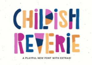
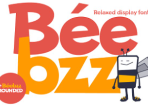
Think of typefaces having personalities. If you are designing an invitation for a child’s birthday party, you are going to want something playfully like these found at Creative Market. And they have many more you can play with. Most of these would fall under the Decorative category so you would want to use them sparingly. To complement the decorative font, you want to use something more neutral from the sans-serif or serif typefaces.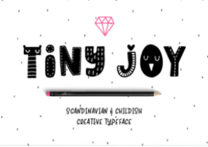
Mixing the sans-serif and serifs in the design
Sans-serif and serifs mix well together. Although there is an ongoing debate about this, serif typefaces work better for the text in a print document, while sans-serifs typefaces work better for text on-screen. The theory is, in printed pieces, serif typefaces are thought to move the eye along more effectively and increase your reading speed. Whereas, sans-serif typefaces with their simplified letters display more clear on-screen. Whether you are designing for print or a digital piece, you want to create a contrast. Mixing sans-serif and serifs is a good first start. Follow that with different font weights and heights to make different areas stand apart from one another. You can also change the kerning. Kerning is the space between each letter. If you are designing a website, whether, in WordPress or any other program, it’s called letter-spacing. Now with that being said, you can achieve the same goal by using one typeface and make the same changes mentioned above. The one thing you want to avoid is causing a conflict. What causes conflicts are if, you use a fine serif typeface and then combine it with a heavy sans-serif typeface. You could quickly end up with a Goliath and David look. Good rules for pairing typefaces to follow are:
With respect to slab-serif and handwritten, they come under sans-serif and script respectively.

0 Comments