Inspiration; where do you find it when a client comes to you for a new logo design is a question I’m often asked.
When I first speak with a client regarding a new logo design, I ask them two questions:
- What are your favorite colors?
- Do you have an icon idea that you would like your logo design to have in it?
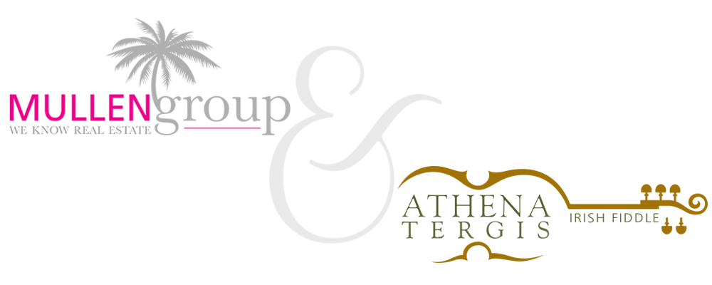
Here are two recent logo designs from the answers to those two questions.
Kathy Mullen found me through LinkedIn Profinder. She is a realtor and while new to the Palm Beach Gardens area, she is a Florida native. Acknowledging it was cliché, she knew she wanted a palm tree in her logo. Her favorite color is magenta.
With magenta being such a strong color, I wanted the accent color to be soft and complimentary. I accomplished this by using fifty-percent of black. Once the business cards were printed on a fourteen point matte paper with a silk finish, the gray actually took on the look of silver.
When it came to the palm tree, I didn’t want to just plop a tree anywhere just for the sake of plopping a palm tree in the design. In the near future, Kathy will have other realtors working underneath her, the palm tree was designed as an umbrella to cover the group.
The fonts I used were Frutiger Roman and Baskerville Regular
Athena is a world renown Irish fiddle player. Last year, I designed for her and her husband, Mario Bollag the award-winning website Terrasole for their Italian winery. She came to me this year to design her website. My first step though was to design her logo.
When I asked Athena, about her favorite colors and what she would like in her logo, her response was, “I don’t know, what do you think?”
I definitely thought the logo needed a fiddle, but not just an image of a fiddle. I wanted it to be more of a suggestion of a fiddle. Being known for five pegged fiddle, the design also had to include the fifth peg.
When it came to the colors, I wanted a green, but not Kelly green and went with Pantone 5753, more of an olive green. For the fiddle, I knew I didn’t want to use brown since there are many brown and gold tones in her fiddle. I chose to go with Pantone 132 one of their gold colors.
The fonts I used were Goudy Old Style and Frutiger Light.
Inspiration; what is your inspiration for a logo design? Do you currently have a logo that needs to be freshened up? Click here and let’s talk about it.


0 Comments